Global city data, visualised
See the project demo and source code
I started this project as a tool-sharpening exercise. My goal was, after a recent hiatus from data visualisation work, to get to know some of the tools again, and get my head back into dealing with data - the processes of sourcing, cleaning, exploring, wrangling and transforming into something visual and interactive.
The end result is not perfect - but it has suited my purposes, and at this point I'm willing to leave it as it is and move on to the next thing.
The Global Cities data
I found this collection of city data at the Greater London Authority London Datastore, and it apparently originates from the New York City Global City database. The data from the Excel spreadsheet itself isn't perfect, or complete. (I have my suspicions about figures like Prague's 2,011 Major Ports for instance). For a more complete explanation of the figures, their units of measurement, and what they mean it's worth looking at the New York City Global City database and the cited sources. For my purposes, this collection of numbers was enough for this experiment - but a better annotated and labeled version would be required to make this a full piece of data-driven communication.
Dataviz tools and libraries
The main purpose here was for me to exercise the tools. My intention at the outset was to only use D3.js to process the data and transform it to SVG or DOM elements for display - but I found I wanted something with better DOM manipulation and some kind of component or template capability so I could define a basic city, and load in the data. So I experimented with for a while Ractive.js components and its Handlebars templates, which I've enjoyed using before. But once I was down the component route I thought it would be interesting to take the plunge and try out React.js, which is new to me. Eventually, I found the only use I had for D3.js was the scale functions - and I was pleased to discover how modular the upcoming release of D3.js is, and how the library components is in the process of been decoupled - which fits far better with my workflow.
So I settled on a React and D3.js combination, bundled using Browserify and Babel's React and ES2015 filters, with some lodash to help with some maps and filtering.
Wrangling the data
In some podcast or blog somewhere in my recent research I picked up a link to Data Wrangling & Exploratory Analysis Platform | Trifacta - which impressed me with it's ability to digest the initial Excel spreadsheet, which was divided into sections. Trifacta is a really good product but it couldn't do everything. I resorted to Excel to transpose the rows to columns, and to some manual search and replace to fix some of the data. I had particular problems with the mixed datatypes on some columns (null or missing data was indicated with a ----- which caused the whole column to be exported as String data and played havoc with d3's scaling functions or lodash's min/max functions, ordering data alphabetically rather than numerically. I fired up Mr Data Converter a couple times - but I don't think it was actually required (but helped examine the data in optional formats).
Representing the data
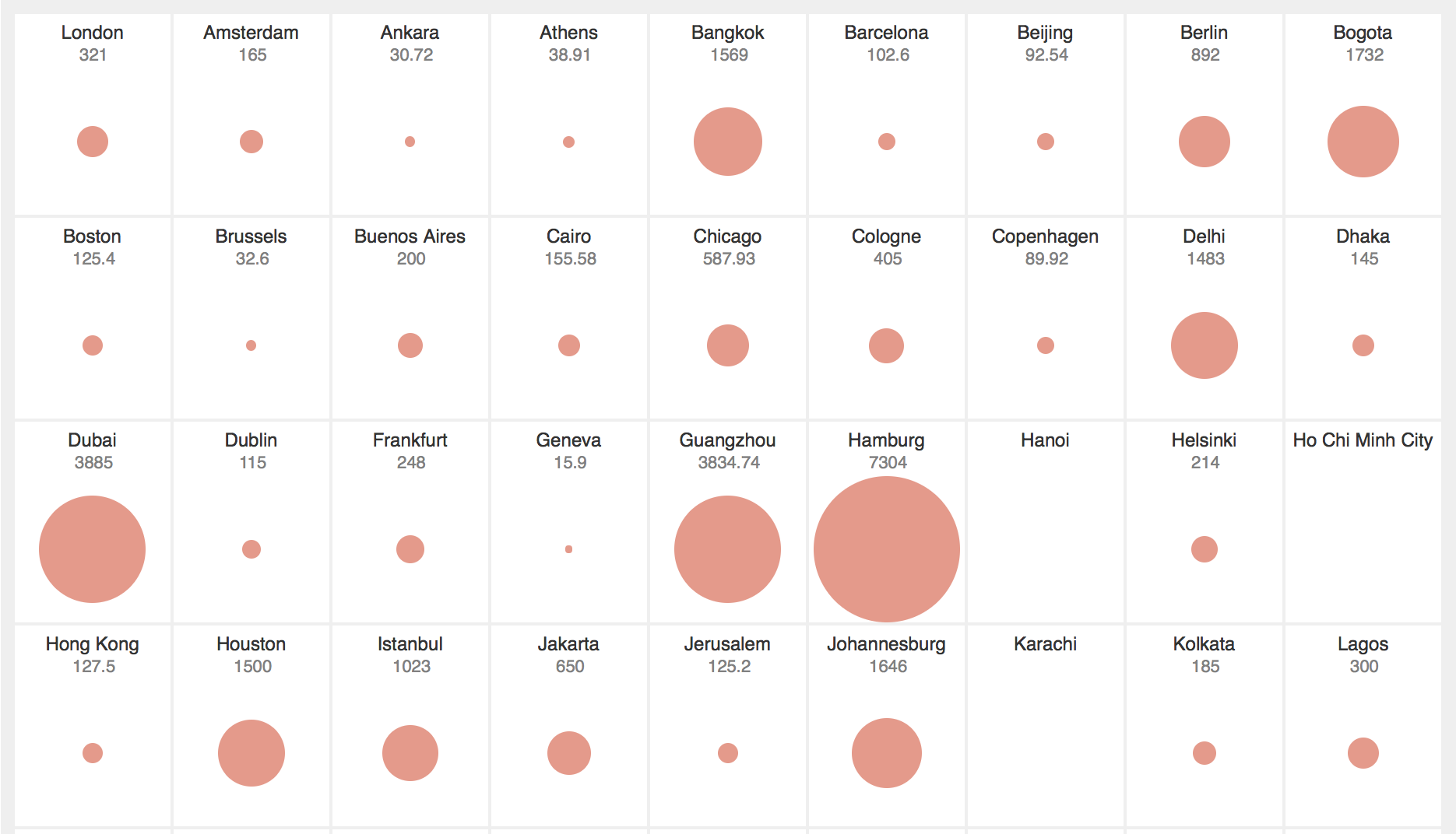
I had a mental image of this visualisation from the moment I saw this dataset: the ability to see at a glance all the cities' proportions at once and to be able to depict broad comparisons. Somewhere between Tufte's small multiples and Hans Rosling's bubble charts.
My idea here is simplicity and limiting the view to single facets of the data to highlight comparison.
Technical issues with the representations
I hit some issues with the accuracy of the representation, mostly indicating my rustiness with visualisation techniques:
- in my initial version I made the data correspond to the radius of the circle. This is a novice mistake and something all beginner texts on visulisation warn you against. I realised my mistake, and adjusted this so the area of the circle relates to the quantity represented.
- I had created padding around the circles to give them some space - but this created problems with the size - and the circles weren't showing the variation I expected.
- Some of the
nullvalues where data for when a city's data was unavailable was being counted in the scaling calculation. This skewed the resulting visualisations, and made the differences between some cities look less significant. An example was the Life Expectancy figures - when the null values were included, anything above 50 looked pretty good. But when I removed the null items from the scale, the difference between 54 for Johannesburg and 82 for Copenhagen is much more noticeable. - I had further problems with the lowest values in a set because of the way I scaled the data - and were showing up as zero, and not drawing a any circle. I adjusted my scale to be from
3to100instead of0to100so something shows for the lowest item - perhaps there are better ways to do this? - I made a later adjustment, converting the data representation from ordinal to quantitative. Initially each city's data was represented on a relative scale from 1-100 for the active data set. This let to poor representations. A range of 50, 55, 60 was represented as a very small dot, a medium size circle, and a full size circle. I adjusted this so values are scaled to a proportion of the maximum value in the set, and keeping it zero based.
Problems with the visualisation
The visualisation shows how cities compare by scaling the real numbers and using the same visual language for a range of data groups. This potentially distorts perceptions of the numbers themselves. London's 5 major airports are represented by the same size circle as Tokyo's 34.99 million Metro population, and Lagos's 85 per 1000 Infant deaths. They are all maximums in their respective sets, but clearly are not of equal value.
The visualisation gives the user an idea of how numbers for a data category spread across other cities included in the group - but it doesn't account for cities not there - so it is not a complete set. Nor does it try to portray the internal relationships of the data within the individual cities. So there is no way of building a reasonable representation of a city or its overall character from these visualisations.
Some ideas for extending
I had some ideas… maybe one day I'll get to them.
- Geography: positioning the city circles on a global map instead of a grid. How would this affect comparison? Would there be overlap in dense the denser metropolis areas that would obscure the representation? I thought a compromise may be to allow users to click or hover over each city to reveal a pop up panel with a map and some other non-numeric data.
- Comparison: I experimented with allowing users to select a second data set for comparison, represented by a second circle with a different colour. But the result was confusing clutter, and the initial simplicity was lost. It also raised questions visually - indicating some connection between the different data where the circles overlapped, which there was none. I'm sure there are ways to explore the correlations between the data for each city - but that's a different visualisation.